Redesigning the digital home of Flusshelden — a non-profit fighting plastic pollution in Germany’s waterways.

Duration
2 weeks

Role
Research & Discovery - UX/UI

Tools

Figma, FigGam, Claude, ChatGPT

Overview

The challenge of making people care — and act

Environmental organisations often struggle online: websites feel static,
impersonal, and difficult to navigate. Users arrive motivated but leave
without taking action. Flusshelden needed a platform that matched the
energy of their real-world mission.

01

Increase Volunteer Participation
Lower the barrier to joining clean-up events
through clear, scannable calls-to-action.

02

Simplify Donation Flow
Fewer steps, more trust signals, and honest impact framing in the giving journey.

03

Create Emotional Engagement
Photography, personal stories, and a warm color palette to build genuine connection.

04

Improve Content Readability
Clear hierarchy, generous whitespace, and accessible typography for all ages.

01

Build Trust Through Visual Storytelling
Authentic imagery, milestone timelines, and community spotlights replace generic stock — making impact feel real and verifiable.

DESIGN PROCESS

From research to responsive screenspeople care — and act

Discover & Research
Competitive audit of environmental NGO sites. Identified patterns: buried CTAs, overwhelming copy, no clear donation hierarchy, and lack of social proof.

Define & Structure
Mapped five user journeys. Defined a flat, task-oriented IA with four primary navigation items — all destinations reachable in one click.
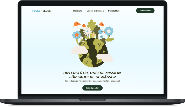
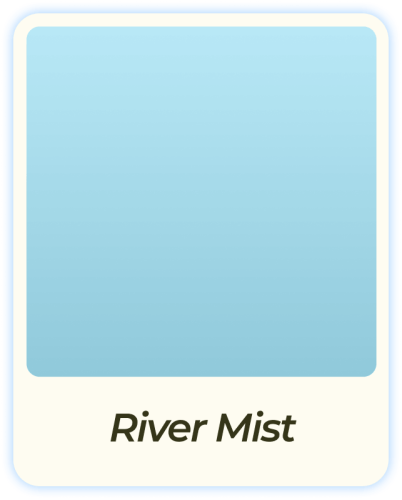
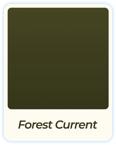
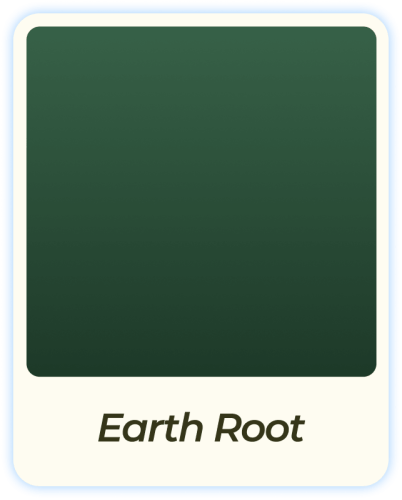
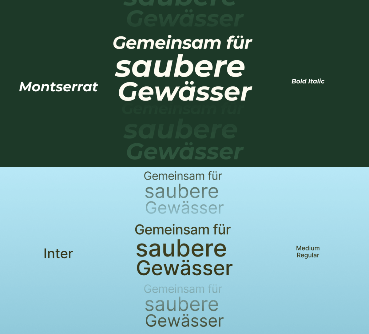
Design System
Built a token set around forest green and river teal. Established type scale, spacing units, and a reusable Figma component library.

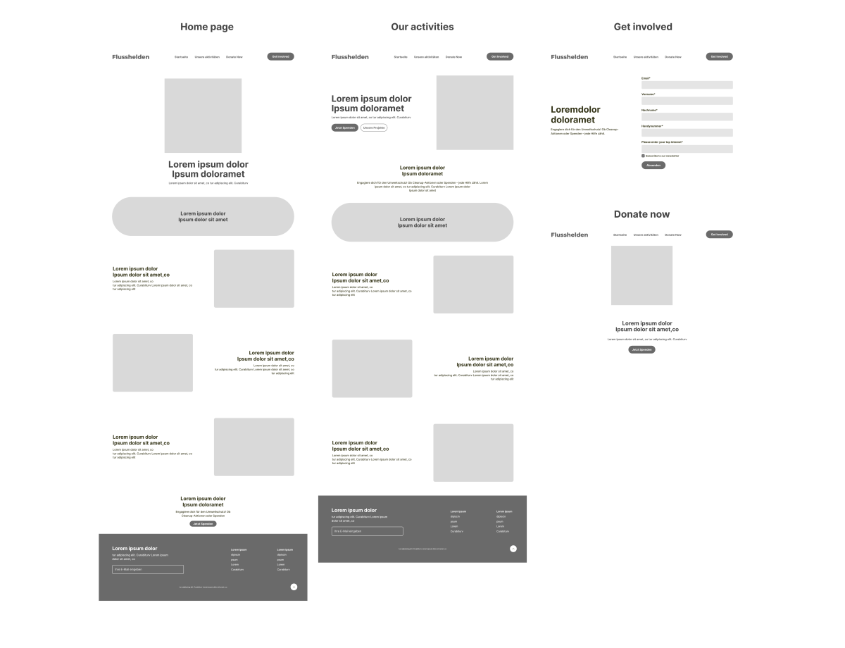
Wireframe & Prototype
Low-fidelity wireframes for all five pages. Layout explorations focused on Home hero, "Get Involved" CTA block, and donation modal — highest-impact screens.

High-Fidelity & Iteration
Full hi-fi screens for desktop (MacBook Pro 14") with mobile adaptation. Three feedback rounds refining visual hierarchy and copy tone.

DESIGN SYSTEM

Color palette

Typography

Icons

Illustrations

Wireframes

KEY SCREENS

Pages designed with intention

OUTCOMES

Measurable goals, tangible improvements

↓ 60%

Fewer steps
in the donation flow

4 pages

Flat nav — all destinations
in one click

WCAG AA

All contrast ratios pass accessibility standards

REFLECTIONS

What this project taught me

 🌊

Emotion before information
The most effective screen started with a real photograph and a single human sentence. Feeling precedes reading.

🎯

One action per screen
Forcing each page to have a single unambiguous CTA removed layout indecision and produced cleaner designs.

♻️

Design systems pay forward
Building a token-based component library early meant the final iteration
took half the time of the first.